How to Choose a Squarespace Template for a Chiropractic Website
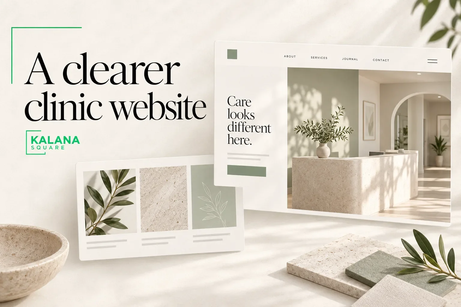
he best Squarespace template for a chiropractic website is one that can present your services clearly, introduce the practitioner, explain what a first visit involves and make the appropriate appointment route easy to find.
It does not need to be labelled “chiropractic.” In Squarespace 7.1, starting designs share the same core template features and styling options. The important decision is how the design will be adapted to the practice, not which demo photograph appears on it. Read Squarespace’s template guidance.
This guide covers website planning and design. Medical claims, patient communications and privacy arrangements should be reviewed by the practice’s appropriate professionals.
Choose around patient questions
A person considering a new practice may want to know where you are located, who they will see, what services you offer and how to request an appointment.
They may also need information about fees, insurance arrangements, accessibility, parking or what to bring. The exact details depend on the practice, but a template should make these answers easy to organize.
Write the questions before evaluating design demos. This prevents a visually appealing layout from becoming a reason to omit important information.
Three useful starting layouts
A practitioner-led layout
This approach introduces the practitioner early, supported by a concise description of the practice and an obvious appointment route. It can suit a small practice where the relationship with the named professional is central to the decision.
Allow enough space for verified credentials, a professional photograph and a clear explanation of the approach. Avoid making the biography so long that practical service information becomes difficult to find.
A service-led layout
This structure begins with the practice’s main services and routes visitors to dedicated pages. It can work when the practice has several distinct offers that require separate explanation.
The homepage should summarize rather than repeat every service page. A consistent layout helps visitors compare information without learning a new navigation pattern each time.
A multi-practitioner or location-led layout
If visitors need to choose between practitioners or locations, those choices should be visible and clearly labelled. Each profile or location page needs accurate, specific information.
Do not create many near-identical local pages simply by changing a place name. Use separate pages when there is a real location or meaningful difference to explain.
Review the page structure before buying a template
A useful starting sitemap may include:
Home
Services
Individual service pages where needed
About the practice
Practitioner profiles
Your first visit
Fees or payment information
Location and contact
Appointment request or booking
Not every practice needs every page. A small practice may combine related information; a larger one may need a more detailed structure.
Check whether the chosen design gives you a practical way to build these pages. A beautiful one-page demo may require significant adaptation if the practice needs a larger content structure.
Make the appointment route understandable
Decide whether the website should collect an appointment request or complete a confirmed booking. Those are different workflows and should use different wording.
“Request an appointment” should explain when the practice will respond. A live booking route should clearly communicate available appointment types and any relevant instructions.
Use the practice’s approved booking or patient-management system where required. Do not assume that a standard website form is suitable for collecting detailed health information. Limit initial contact fields to what is appropriate for that workflow.
Test the transition from the service page to the booking tool, including on a phone. A consistent experience helps visitors understand that they are still dealing with the same practice.
Prioritize readable, calm design
A restrained layout can help information feel approachable. It should still provide sufficient contrast, readable text and recognizable controls.
Avoid choosing pale text or very small typography simply because it appears elegant in a demo. Essential information should remain readable on a phone without zooming.
Real practice photographs can be more useful than decorative stock images. Show the entrance, reception and treatment environment where appropriate and permitted. Images should describe the actual practice, not imply facilities or staff that do not exist.
Build local relevance into the content
State the practice name, address, contact details and opening hours accurately. Explain the area served in natural language and provide practical arrival information.
For service pages, write a clear explanation approved by the practice rather than copying generic descriptions from other clinics. Avoid exaggerated outcome claims or unsupported statements about treatment effectiveness.
A page title should identify the page’s purpose. The contact page can focus on the practice and location, while a service page can focus on the relevant service. Repeating the same keyword list on every page does not improve the reader’s experience.
Do not confuse template choice with clinical credibility
A template cannot verify credentials, medical statements or patient testimonials. Those require accurate source information and appropriate review.
Your website designer can organize and present the material, but the practice must approve clinical descriptions and any required notices. This responsibility should be included in the project process.
Similarly, website design alone does not establish privacy compliance. Forms, integrations, contracts and operating procedures must be assessed together when sensitive information is involved.
What a designer should help you evaluate
Before commissioning the site, ask the designer to explain how the template will support your content, appointment workflow and ongoing edits.
Request a demonstration of a service page, practitioner page and booking route. These three examples reveal more than a homepage mockup.
If you already have a site, review which URLs and pages should remain. A template change should not become an excuse to discard useful existing content without checking its value.
Frequently asked questions
Do I need a chiropractic-specific template?
No. You need a design that can support your practice information and appointment journey. The starting category is less important than the final structure.
Can Squarespace connect to a booking system?
Potentially, depending on the system’s supported linking or embedding options. Confirm the exact workflow, costs and privacy requirements before committing.
Can I use the website for patient forms?
Only after the practice has assessed the tool and information being collected. Do not place sensitive intake questions in a generic contact form by default.
Plan a website around your practice
I help healthcare and service businesses turn their requirements into clear Squarespace websites. You can explore my portfolio and custom website design service to understand my work.
Book a discovery call to discuss your chiropractic website, content structure and booking requirements.