Squarespace Landing Pages for Paid Ads: What to Include Before You Spend
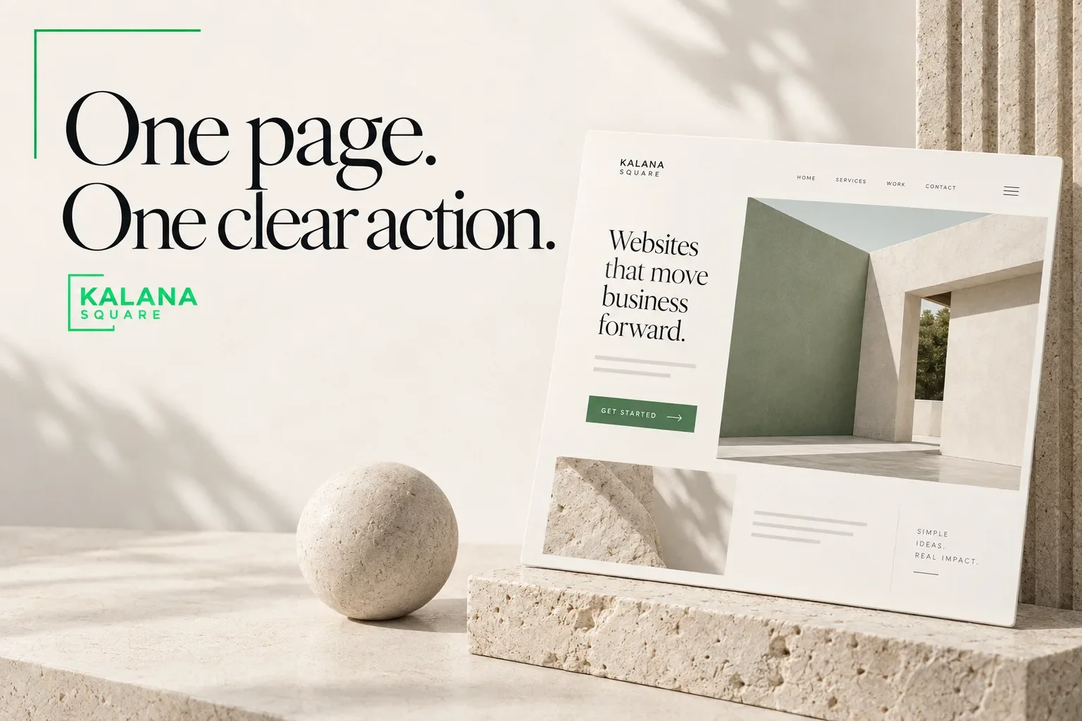
A Squarespace landing page for paid ads should present one relevant offer, explain why it fits the visitor, provide credible evidence and make a clear next action easy to complete.
Start with the campaign’s promise. If someone clicks an ad about a specific service, the destination should immediately explain that service. Sending every campaign to a general homepage can leave visitors searching for the information that attracted them.
A dedicated page does not guarantee profitable advertising. It gives you a more focused experience to test and improve alongside the targeting, creative and offer.
Match the page to the reason someone clicked
Write down the ad’s audience, promise and action before designing the page. Then check whether the headline and first paragraph continue that same message.
For a fictional bookkeeping campaign aimed at independent consultants, a headline about general financial success is too broad. A more useful opening would explain the bookkeeping service, who it supports and how the initial conversation works.
Google describes landing-page experience in terms of how relevant and useful a destination is to people who click an ad. Its Quality Score is a diagnostic tool, not a business outcome to optimize in isolation. Google Ads guidance on Quality Score
Use that relevance principle to review the customer journey, while judging campaign success through real enquiries and business results.
Give the page one primary conversion goal
Choose the action that makes sense for the offer. It might be an enquiry, a consultation booking, a purchase or a resource request.
You can repeat that action throughout a longer page. Repetition is useful when each button follows information that helps the visitor decide. The problem is competing goals that pull attention in unrelated directions.
A consultation page does not need equally prominent invitations to read every article, follow every social account and explore every service. Keep supporting information accessible without making all actions visually equal.
Use a specific button label that tells people what happens next.
Explain the offer before asking for commitment
Visitors should understand what the service includes, who it is suitable for and what the first step involves. Answer the questions a reasonable buyer would ask before contacting you.
For a service campaign, useful sections often include the problem, the service scope, expected deliverables, the process and relevant proof. If there are important exclusions or qualification requirements, explain them clearly.
Avoid replacing useful detail with broad claims such as “transform your business.” Describe the actual work. A visitor should be able to explain the offer to a colleague after reading the page.
Where appropriate, disclose a starting price or explain how quotes are prepared. Use only pricing the business has approved.
Put relevant proof near the decision
Choose evidence that relates to the advertised service and the visitor’s situation. One well-explained project can be more useful than a large collection of unrelated logos.
If you share a result, explain what was measured and over what period. Do not attribute every improvement to the website when advertising, seasonality or sales changes may also have contributed.
Testimonials should be genuine and used with permission. If you do not have measured results yet, show the work, explain the process and identify the problem it was designed to address.
Credibility comes from specificity and honest context. Decorative statistics without an evidence trail can weaken trust.
Keep the enquiry form proportionate
Ask for the information needed to respond usefully. A simple service enquiry might need a name, email, service selection and short project description.
Budget or timeline questions can help qualify work, but they should have a clear purpose. Do not require a detailed discovery questionnaire merely to begin a conversation unless the service genuinely needs it.
Explain what happens after submission. Say whether the business will email, call or invite the visitor to book, and use a response-time statement the team can meet.
Check that the form reaches the correct recipient and that the confirmation message is understandable. A successful visual design cannot compensate for a lost submission.
Plan for mobile visitors
Read the page on a phone from top to bottom. The headline, offer and main action should remain clear without relying on the desktop composition.
Check image crops, paragraph length, buttons and form fields. Avoid placing essential details only inside a decorative image. Confirm that any booking embed works comfortably on a smaller screen.
Review the page’s weight as well. Large videos and unnecessary widgets may add friction before a visitor reaches the offer. Use media when it supports the decision, and test the actual published experience.
Measure completed actions, not only clicks
Separate intermediate actions from outcomes. Clicking a booking button is different from confirming an appointment. Starting a form is different from submitting it successfully.
Before launching the campaign, define the primary conversion and verify that the implementation records it appropriately. Compare tracking with actual enquiry or booking records so you understand gaps and duplicate events.
Use tagged campaign URLs consistently. Keep the source, medium, campaign and creative identifiers understandable to the person reviewing results.
Record lead quality too. A page that generates many unsuitable enquiries may need clearer qualification information, different targeting or a revised offer.
Improve the page through focused tests
Begin with an observed problem. If people arrive but do not understand the offer, test the headline and explanation. If qualified visitors abandon the form, review its fields and expectations.
Change a limited set of elements at a time and keep a record of what changed. Small traffic volumes can produce noisy results, so avoid declaring a winner after a handful of visits.
Discuss findings with the person responding to enquiries. Their conversations can reveal questions the analytics do not explain.
Frequently asked questions
Can I use my homepage for paid ads?
Yes, when it closely matches the campaign’s intent and makes the relevant action clear. A dedicated page is useful when the campaign targets a more specific offer or audience than the homepage.
Should a landing page remove all navigation?
Not automatically. Reduce distractions while preserving access to information visitors need to trust the business. The right navigation depends on the offer, audience and buying decision.
Will a new landing page make my ads profitable?
There is no guarantee. Results also depend on targeting, demand, pricing, creative and sales follow-up. The page is one part of the complete campaign.
Prepare your campaign destination
Kalana Square creates Squarespace landing pages built around a specific audience, offer and next action.
Schedule a consultation with your campaign idea or existing ad destination. We can review the message, page structure and enquiry journey before you send more traffic to it.