In-Home MD: Designing a Squarespace Website Around Patient Clarity
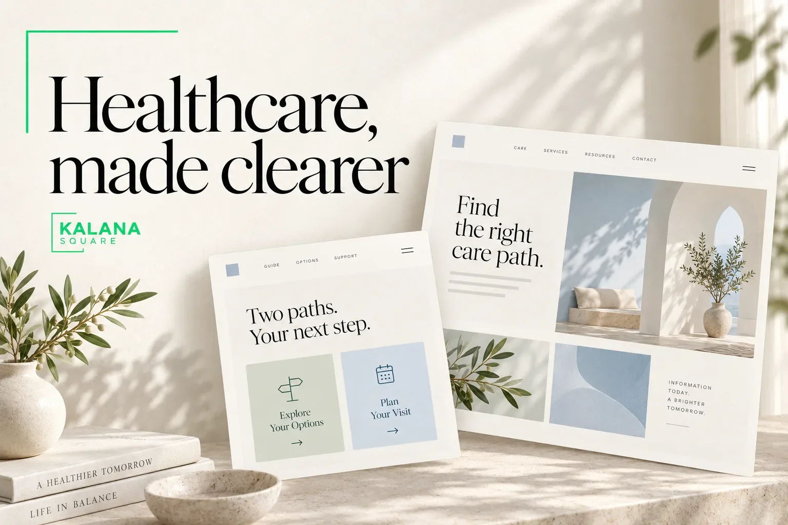
A medical practice website needs to help people understand the service and the appropriate next step. It must also communicate carefully, because visitors may be making decisions for themselves or an older family member.
The In-Home MD project is an example of organizing a Squarespace website around clear information for different patient groups. This case study separates the published project facts from broader design lessons that other practices can apply.
It discusses website design, not medical advice or a certification of privacy compliance.
The practice and website brief
In-Home MD is a Memphis-based independent practice providing primary care in the homes of seniors and older adults. The published brief describes a physician moving into independent practice and a need to reassure existing patients while explaining the service to new ones.
I built a multi-page Squarespace website with separate information for current and new patients, service descriptions, a physician profile, testimonials and a contact section. The intended design direction was professional, approachable and suitable for the audience.
The In-Home MD portfolio entry contains the project summary and website preview.
The documented outcome is the delivered website structure. This article does not claim a measured increase in patients, appointments or search traffic.
Lesson 1: different visitors need different answers
An existing patient may want reassurance about continuity and practical instructions. A new patient may need to understand the service, eligibility and how to begin.
Trying to answer both sets of questions in one long introduction can make the page harder to use. Clear routes allow each visitor to find relevant information without reading everything.
For other practices, the audience groups may be different: patients and referring professionals, new and returning clients, or people seeking different service types. Identify those groups from the actual practice workflow.
The design task is to simplify the choice without introducing unnecessary barriers.
Lesson 2: explain how the service works
An unfamiliar service model needs a clear explanation. Visitors should understand where the service is delivered, whom it serves and how to make an appropriate initial enquiry.
Avoid assuming that a service name answers these questions. Brief, specific descriptions can reduce uncertainty before someone contacts the practice.
The practice should approve all information about eligibility, services and availability. A designer can organize that information but should not invent clinical details or expand the offer beyond what is actually provided.
This distinction is especially important when writing search-focused content. Relevance does not justify adding unsupported health claims.
Lesson 3: introduce the professional clearly
A practitioner profile helps visitors understand who is behind the service. It can include verified qualifications, professional background and an explanation of the approach in language the audience understands.
Use an appropriate real photograph when available and approved. Avoid generic stock imagery that could be mistaken for the actual practitioner or staff.
A clear profile should support the visitor’s decision without overwhelming the page. Longer biographical information can sit on a dedicated page, while the homepage introduces the essential facts.
Trust is supported by accurate information and consistency, not simply by adding badges or promotional claims.
Lesson 4: design for readability
When a website serves older adults and family members, readability deserves deliberate attention. Comfortable text, clear headings and obvious navigation help people understand the page without unnecessary effort.
A calm visual style should not rely on faint text or very small controls. Check contrast, spacing and the way headings wrap on narrower screens.
Avoid placing important instructions only inside images. Use real page text so the information can be resized, selected and understood by assistive tools.
These are practical design priorities, not a claim that any particular website has passed a formal accessibility audit. Formal compliance statements need an appropriate assessment.
Lesson 5: make contact instructions precise
A contact route should explain its purpose. Visitors need to know whether they are requesting information, asking the practice to call back or booking an appointment.
The website should also communicate the practice’s approved instructions about what not to send through ordinary contact channels. Sensitive health details should not be requested casually in a general form.
Any patient portal or intake system needs to be assessed as part of the wider operational and privacy setup. Visual design alone cannot establish that a workflow is compliant.
For new projects, I recommend deciding the contact process before building the form, then testing both the visitor experience and the receiving workflow.
Lesson 6: keep information consistent
Practice names, service descriptions, phone numbers and location details should agree across the website. Inconsistency makes it harder for visitors to know which information is current.
Create a simple update checklist covering the homepage, service pages, practitioner profile and contact information. If a detail changes, review each place where it appears.
This is also useful when a practice changes its operating model. The website should describe the current service rather than preserving old instructions because they were part of the original build.
How to assess results responsibly
Useful website measurements might include completed appointment requests, relevant phone enquiries and visits to patient-information pages. Define the meaning of each measure before interpreting it.
Do not send sensitive patient information into analytics tools. A practice should review its tracking and privacy arrangements with the appropriate specialists.
Without a reliable baseline and a suitable comparison period, a claim such as “the new design increased bookings” would be premature. The responsible starting point is to document what was delivered and what will be measured next.
What other practices can take from this project
Begin with the questions visitors actually need answered. Build clear routes for different audience groups, explain the service, introduce the professional and make the next step understandable.
The website does not need unnecessary visual complexity to feel credible. Its job is to present accurate information in a way that people can use.
These principles apply beyond in-home care, but each practice requires its own content review and operational assessment. A template should never substitute for that work.
Frequently asked questions
Is this a before-and-after performance case study?
No. It documents the brief and delivered website, with practical design lessons. Verified conversion or traffic changes are not included.
Can Squarespace be used for a medical practice website?
It can be considered for public-facing practice information. Sensitive workflows, integrations and compliance requirements must be assessed separately.
Who should approve the medical content?
The practice’s responsible professional should approve service descriptions, credentials and clinical statements before publication.
Plan a clearer healthcare website
I help healthcare businesses organize their public-facing information and build professional Squarespace websites. Explore my custom website design service, then book a discovery call to discuss your practice’s requirements.