Squarespace Mobile Optimization: 12 Fixes That Can Improve Enquiries
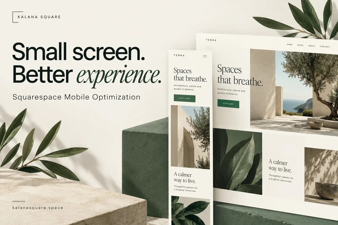
Your website may look polished on a desktop and still be difficult to use on a phone. A headline fills the first screen, a photograph loses its subject, or a contact button appears several sections after the explanation that should lead to it.
Squarespace provides responsive layouts, but a responsive foundation still needs deliberate design decisions. Mobile optimization is the work of making the smaller-screen experience clear, readable and easy to act on.
What is Squarespace mobile optimization?
Squarespace mobile optimization means reviewing how a website looks, loads and functions on smartphones. It covers content order, typography, navigation, images, forms, interactive features and the complete enquiry or purchase journey.
The purpose is not simply to make everything fit. It is to help a visitor understand the offer and complete the next step without unnecessary effort.
1. Review mobile as its own composition
Do not leave the mobile preview until the final minute. Open it while designing each important page and inspect how the content stacks.
In Fluid Engine sections, mobile positioning and sizing can be arranged separately from desktop, while changes to the shared block content can affect both. Review the Squarespace mobile-layout guidance before making changes.
Look for unnecessary gaps, overlapping blocks and buttons separated from their supporting text. Check both views after editing so a mobile improvement does not accidentally change shared content in a way that weakens desktop.
2. Give the first screen a clear message
A visitor should quickly understand what the business offers, who it helps and where to go next. A large desktop hero with several messages can feel overwhelming when stacked vertically.
Keep one main headline, a concise explanation and a primary action. Move secondary detail lower down rather than shrinking everything to preserve the original arrangement.
For a service business, a clear offer often does more work than a decorative animation. The visual should support the message rather than delay it.
3. Check the reading order
Columns that sit beside each other on desktop become a sequence on mobile. That sequence needs to make sense without the reader remembering information from several screens earlier.
Keep headings close to their explanations. Place evidence near the claim it supports. If an image introduces a topic, make sure its associated text follows logically.
Read the page from top to bottom as a first-time visitor. If a section feels out of place, change the order deliberately rather than treating automatic stacking as the final design.
4. Make typography comfortable
Check headline wrapping, body text size, line spacing and contrast. A word split awkwardly across lines can make an otherwise strong heading look unfinished.
Do not shrink body text just to fit more above the fold. Give paragraphs enough space and break long explanations at natural points.
Try the page in ordinary lighting on a phone, not only on a bright desktop display. Pale text and thin font weights may be harder to read in real conditions.
5. Make the main action easy to select
Buttons need clear labels and enough surrounding space for touch interaction. Two desktop buttons may work better as a vertical stack on a narrow screen.
Use wording that describes the next step. “Discuss My Website” or “View Services” gives more context than a vague label. If a button opens a booking tool, check the complete experience after the click.
Repeat the main action where it is useful on a long page. Visitors should not have to remember where the first button appeared and scroll all the way back.
6. Simplify navigation
Prioritize the pages that help visitors understand the business and act: services, relevant work, about and contact. Keep secondary links organized without hiding important information inside an excessive number of folders.
Open and close the menu on a real phone. Check long labels, dropdown behaviour and whether a fixed header covers the first section of a page.
Navigation problems can reveal a deeper structure issue. If the menu needs dozens of similar entries, review whether the services themselves should be grouped more clearly.
7. Reduce form friction
A lengthy desktop form can feel even longer on a phone. Ask for the information needed to begin the conversation, and make detailed project questions optional when appropriate.
Check labels, keyboard behaviour, dropdown options and validation messages. Submit a real test and confirm that the success message and notification work.
Use the Squarespace contact form guide to review the questions and delivery process as well as the visual layout.
8. Inspect every important image crop
An image that fills a wide desktop section may crop very differently in a narrow layout. Check faces, products, text inside graphics and website previews.
Adjust focal points, aspect ratios or the layout as appropriate. If the same source image cannot communicate clearly at both sizes, consider a better source or a different presentation.
Avoid using a full desktop screenshot as the only explanation of a detailed project. On a phone, important text inside that screenshot may be unreadable.
9. Investigate slow pages
Large images, background video, multiple fonts and third-party scripts can add work before a page feels ready. Review what is necessary for the page’s purpose.
Use a performance tool to identify potential issues, then test the real experience. A single score is a diagnostic clue, not a complete assessment of the website.
Start with avoidable weight and unnecessary scripts. Check the Squarespace speed guide if you need a structured investigation. Remove code carefully and retest any functionality it supports.
10. Test custom interactions without hovering
Desktop interactions sometimes assume a mouse pointer. A tooltip, menu or hidden button that relies on hover may not work as intended on a touchscreen.
Test sliders, tabs, accordions, pop-ups and embedded booking tools. Check whether controls remain visible and whether fixed elements cover useful content.
If an effect makes the page harder to use, simplify it. The visitor’s task matters more than preserving an interaction that looked impressive in a design preview.
11. Preserve the information people need
Mobile pages can present content differently without removing the essential explanation. Keep important service details, headings, links and supporting information accessible.
Google uses the mobile version of content for indexing. Its mobile-first indexing guidance explains why equivalent essential content matters.
A shorter mobile layout should come from clearer editing and better organization, not from hiding information customers need to make a decision.
12. Complete the whole customer journey
Enter through an article or service page, not only the homepage. Follow the route to a project example, contact form or booking tool.
For stores, test product options, cart editing and checkout. For services, confirm that a visitor can understand the offer and submit an enquiry without a broken or confusing step.
Use the Squarespace preview and a real device. Preview tools help with layout, but they cannot fully reproduce touchscreen interactions, mobile keyboards or every browser behaviour.
How to prioritize the changes
Fix broken actions first: inaccessible menus, unusable forms, hidden purchase controls and major overlaps. Then address clarity and readability. Decorative refinements can follow once the main journey works.
Use analytics to identify important mobile landing pages and compare completed actions where tracking is available. Traffic volume alone does not tell you whether visitors can use the page successfully.
Keep a short change log. Review one problem at a time where practical, and check the full page after editing because spacing and content changes can affect nearby sections.
Frequently asked questions
Does Squarespace automatically make a site mobile-friendly?
Squarespace provides responsive behaviour, but content, crops, custom code and customer journeys still need review. Automatic responsiveness is a starting point for mobile design.
Can mobile edits affect desktop?
Yes. In Fluid Engine, layout positioning can be independent, but shared block content changes can affect both views. Other editing contexts may behave differently, so check both after changes.
Do I need identical desktop and mobile layouts?
No. Keep the essential information and functionality available while adapting the presentation to the screen. A narrow layout usually benefits from a clearer sequence and fewer competing elements.
Will these changes guarantee more enquiries?
No. Mobile usability removes obstacles, but enquiries also depend on the offer, traffic quality, pricing and trust. Measure the wider journey rather than assuming a visual change alone will produce results.
Create a mobile experience that supports your business
Your site should help phone users understand your expertise and take the next step comfortably.
As a Squarespace Marketplace Expert with more than seven years of experience and over 450 completed websites, I help businesses refine mobile layouts, forms and service journeys.
Contact Kalana Square to discuss your Squarespace mobile experience and the changes that deserve priority.